This is a walkthrough I made when trying to create a meaningful, interactive visualization of a dataset of images. The following work is all performed on numbers MNIST
This is a demo repo, can we accessed at:
https://github.com/adamnelsonarcher/DR-classifier-demo
Default representation in 2D
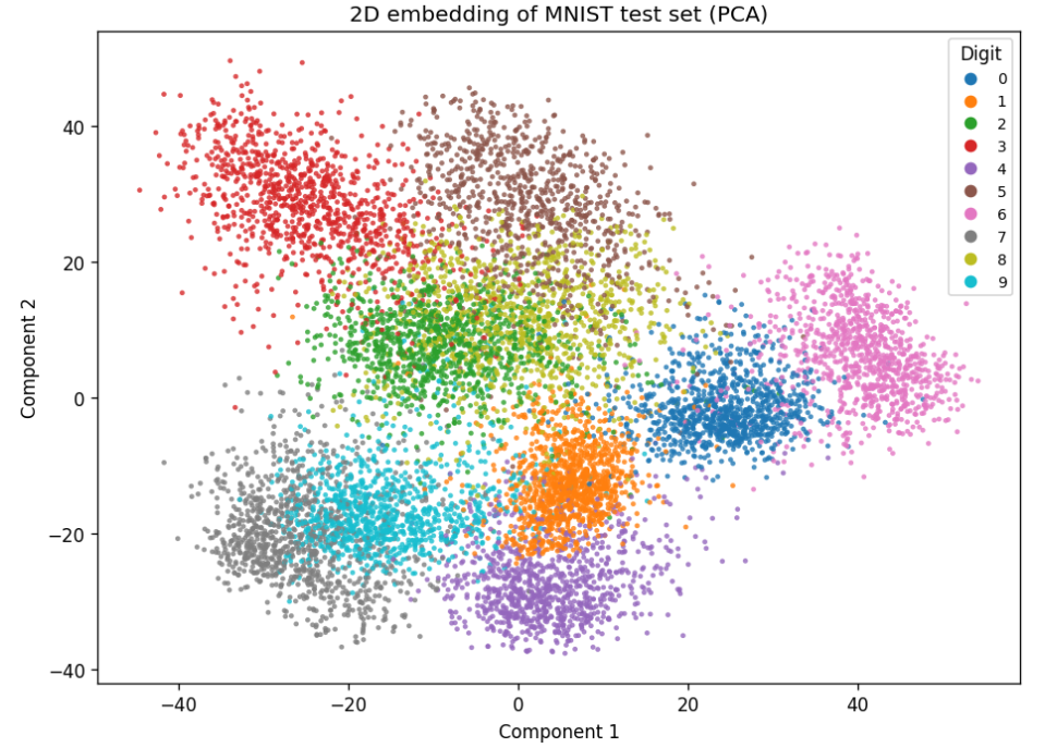
Not great because a lot of overlap.
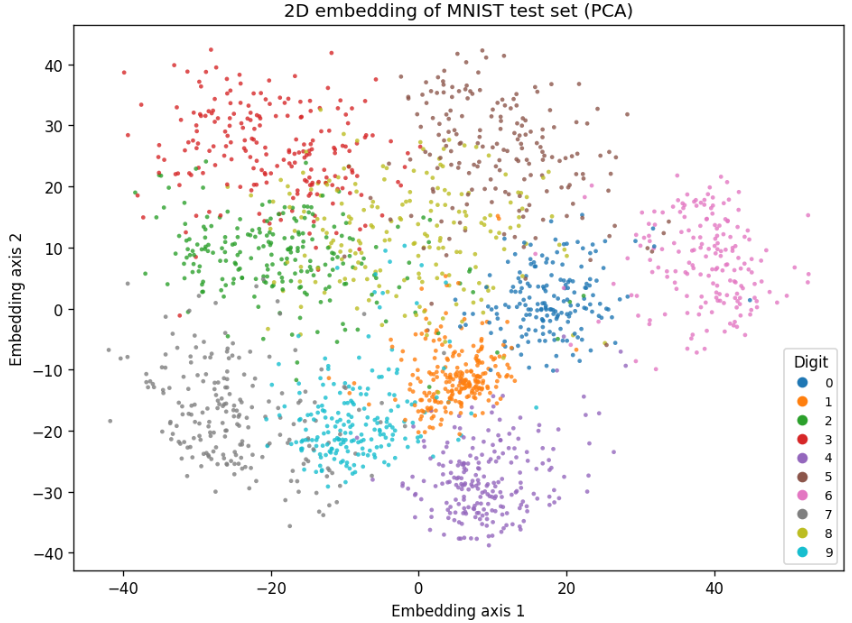
Before we make any complex changes, lets compare PCA with t-SNE:
At 2000 samples:
PCA
t-SNE
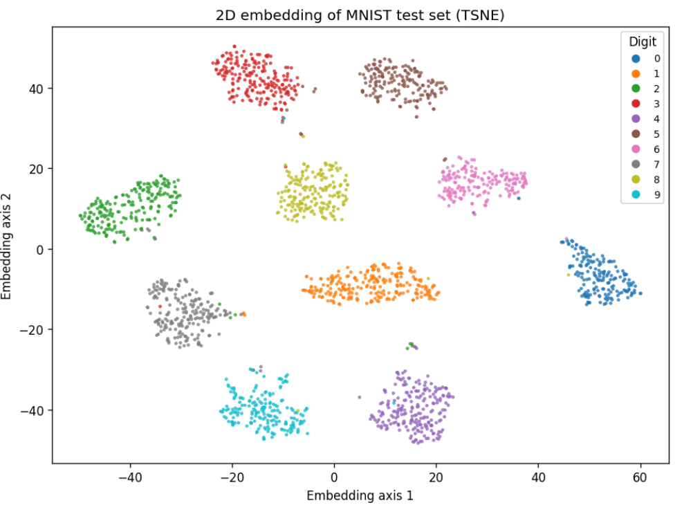
So clearly here t-SNE is a great choice. There are almost no errors in our clustering.
This is just plotting based on two of the best choices for axes.
There are a few more meaningful visualizations that we can make here, pretty easily.
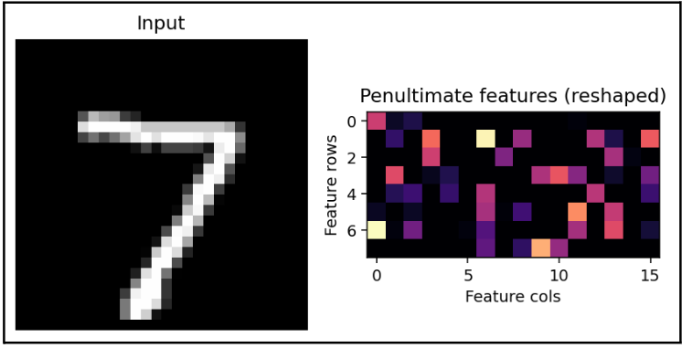
I created a visualization pipeline that will show some important metrics with a given input image.
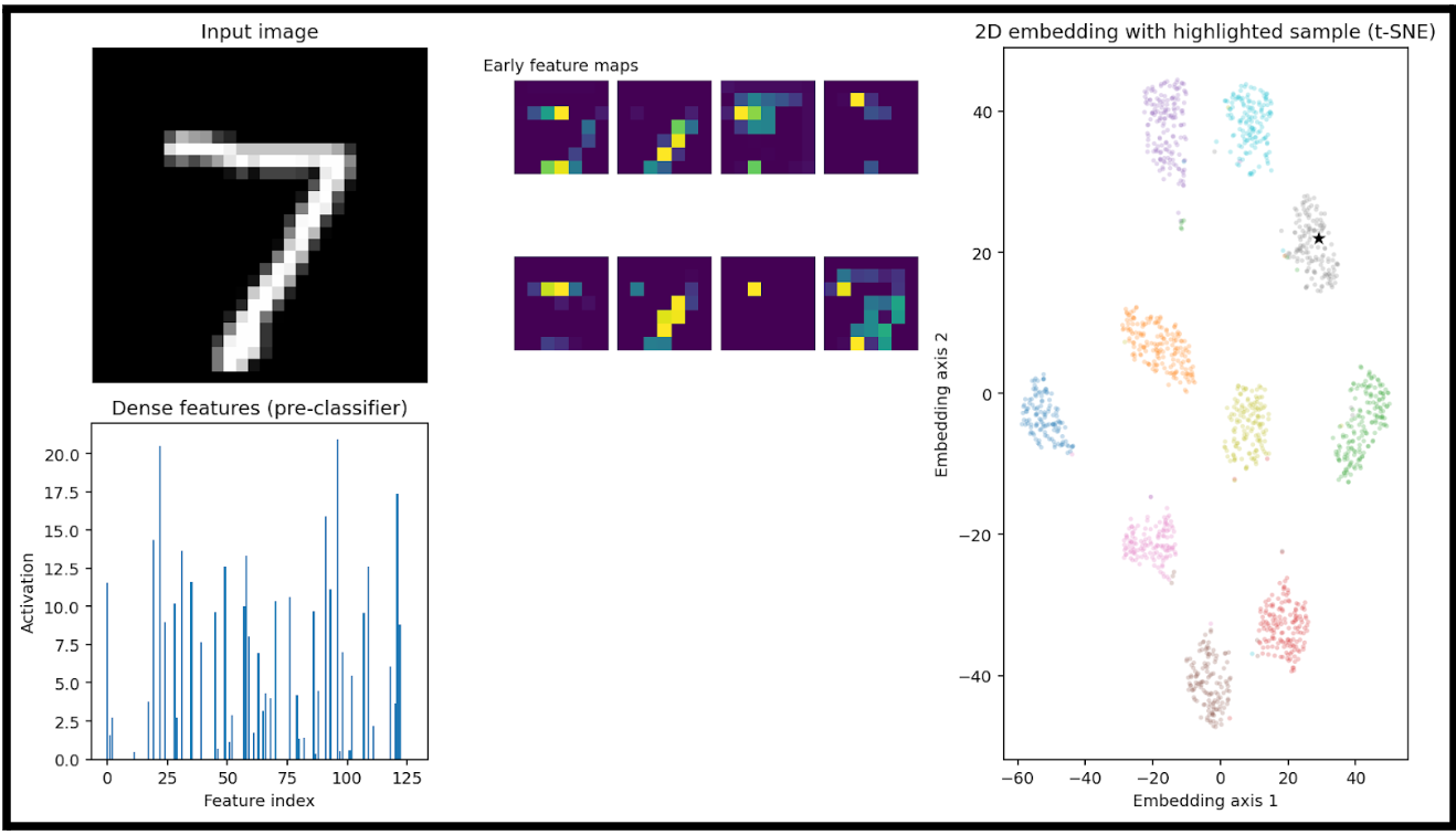
Here we have:
- an input image (7)
-
A heatmap of the big-picture features that the model is extracting (early feature maps)
- These are the activation maps from the first convolutional layer(s) of the trained neural network.
- Each purple square is one channel’s activation output after the first convolution + nonlinearity
-
A bar plot of the learned feature vector right before the final classification layer
- This is the output of the network’s penultimate layer (the flattened or dense embedding), where each bar represents the activation of one dimension of the feature vector.
- This vector is also the input to the dimensionality reduction step in the right-hand plot.
- In this example, this 128D vector is fed into t-SNE
- Lastly, we can see where this specific input would be plotted. Luckily for us, it is right in the cluster of sevens.
This is a good demonstration of taking something that is 128D and representing a relationship in the data that would otherwise not be understandable.
For reference, this is the input data that we are giving to t-SNE, if it were an image:
Not an understandable image.
Let's compare to a different input:
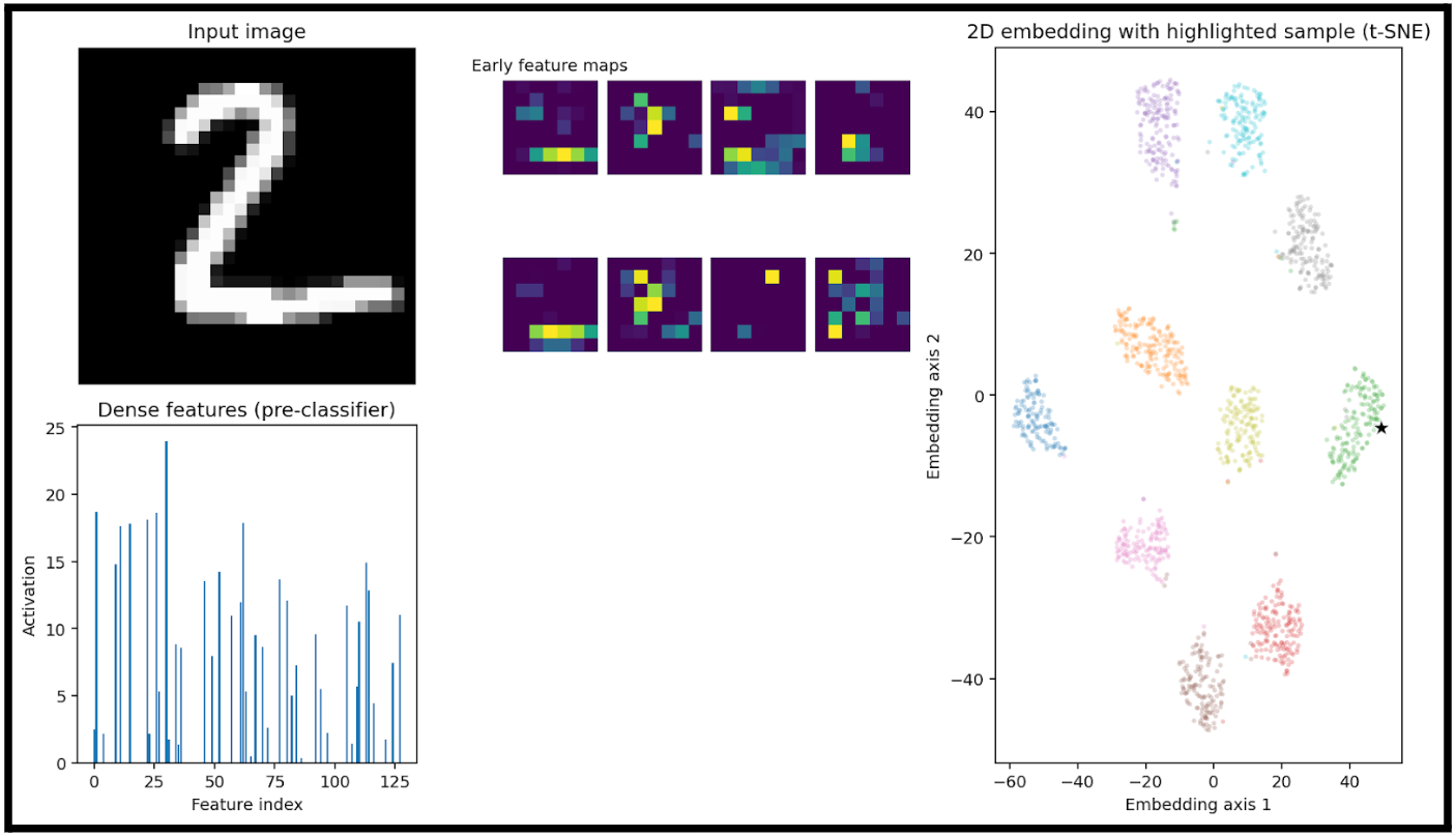
The only thing of note here is really that the activations are very different. Meaning, the vector that we create from a 2 is very different from a 7.
This is almost a trivial observation, as this is what allows clustering to occur, but how can we see what 2D relationship t-SNE is finding in 128 dimensions?
First, lets look at a correlation matrix of the activation function:
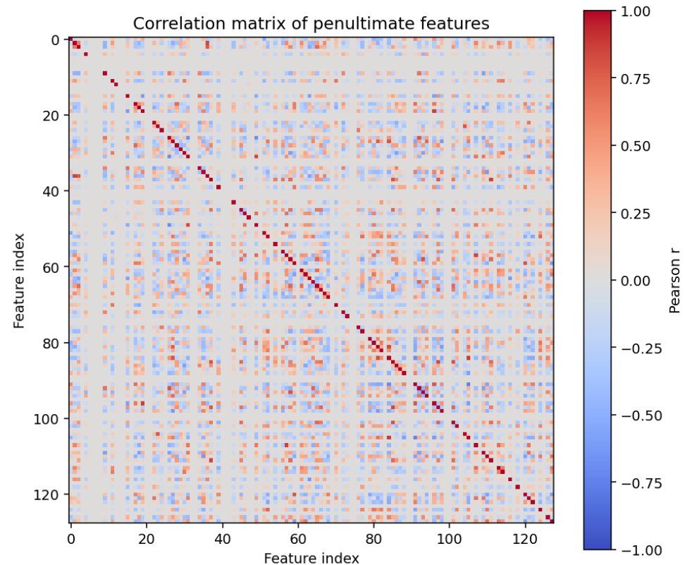
This is basically just noise (because the model produces nearly decorrelated sparse features).
When we generate a correlation matrix of the penultimate layer, we are just showing which neurons fire together.
In a larger dataset, this might look meaningful. With small data like numbers MNIST, a clear connection is rarely seen.
If we were using more convolutional blocks, we might see some clearer relationships here.
Note that t-SNE does not produce interpretable axis weights like PCA does. It is an unsupervised approach and does not produce any global function for our features.
To try and represent the learned relationships from t-SNE, I fitted two ridge regressions to approximate t-SNE axes from the 128 features.

Perhaps there is a better way to visualize the learned relationships, then.
Let's compare results with PCA and throw in UMAP.
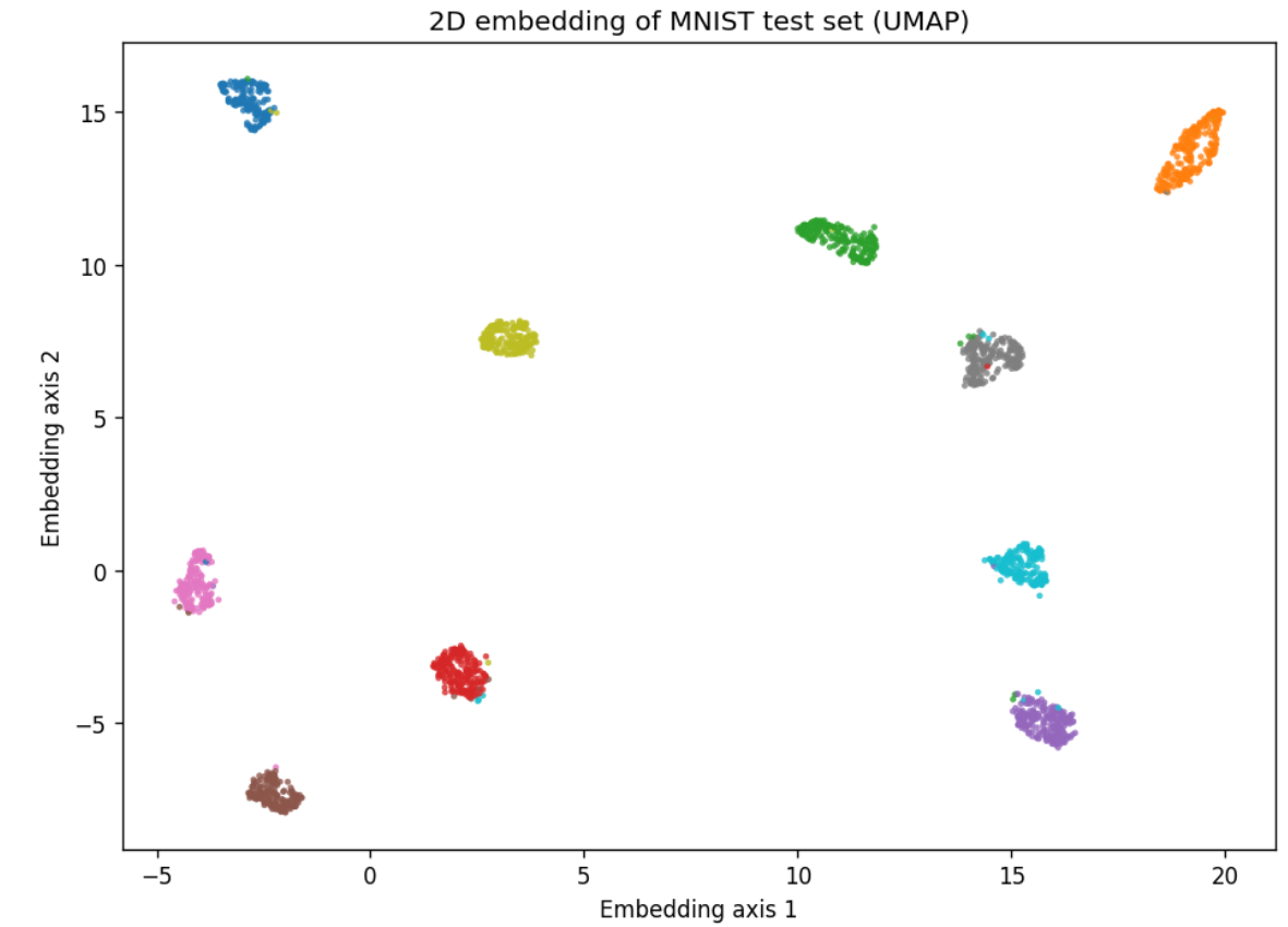
Looks like I was wrong not to include it at the start. UMAP performs very well here.
Regardless, let's look at the 2D relationships created in UMAP and PCA:
For PCA, we can create more meaningful representations of why we are placing points at a given location
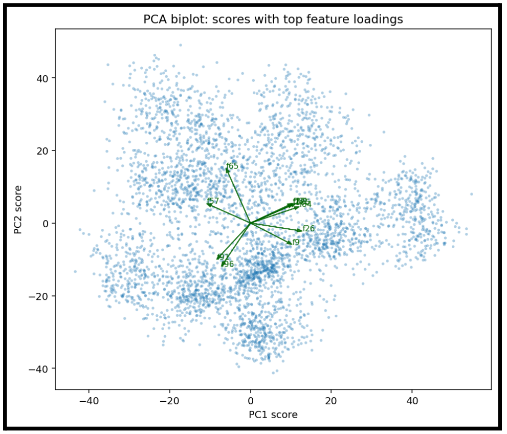
Each arrow represents one feature dimension (one neuron in the penultimate layer) that has a large loading on either PC1 or PC2.
- An arrow pointing strongly in the +PC1 direction means that feature increases PC1.
- An arrow pointing toward +PC2 means it strongly contributes to PC2.
- The length of an arrow shows how strongly that neuron aligns with the PCA axes.
Additionally, now show which components are the most influential to placement variance.
This is a scree plot showing how much variance each principal component explains.
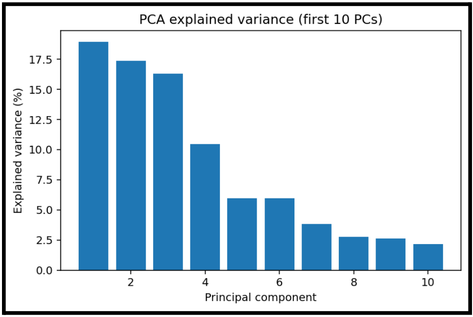
Even though we may have 128 features, most variance lives in the first:
- 3 components: almost half the variance
- 10 components: maybe 85 percent of variance
This is helpful to show, even if PCA is not as effective as visually clustering.
Now, let's take a similar look at UMAP:
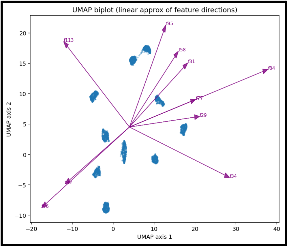
We can create the same kind of feature representation in UMAP.
While we cannot really say one feature is what tells us that we have a given number, this gives us an idea of which features are most influential for a given cluster.
This becomes easier to understand if we focus on a single input and visualize that process:
I wrote a script that will take a single sample, and show the actual method that is being used to place the point on the scatterplot.
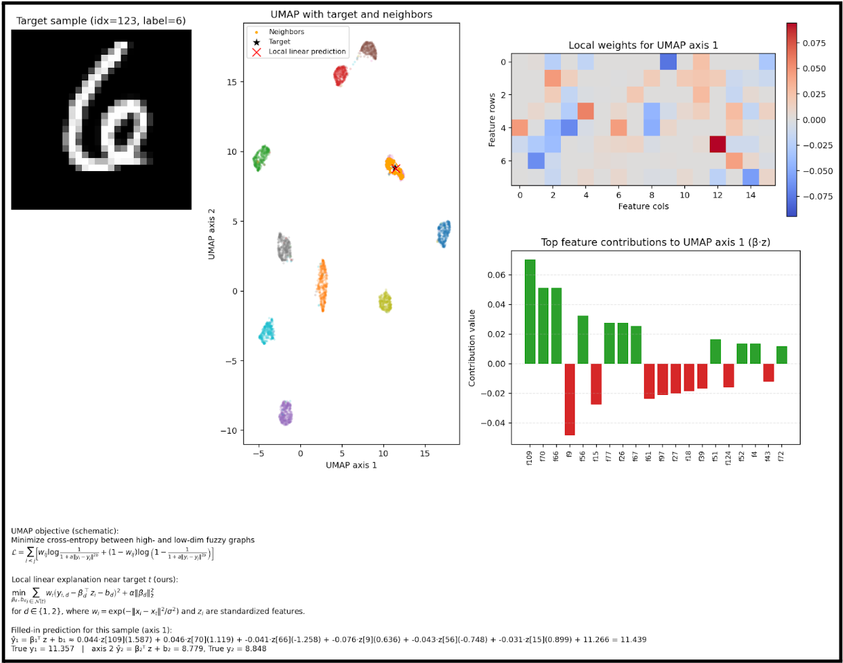
The math is pretty small in this image, apologies. But this is the calculation that occurs for a given input.
We can see here which features are used to determine the placement of the point.
But we can actually represent the placement mathematically, which means we have a clear, linear relationship to follow for a given input.
This is our dimensionality reduction, from 128 to 2.